Wednesday, October 20, 2021

Explaining the difference between duplicate vs. extended screen settings

PowerPoint has a special screen for presenters that shows the slides plus a variety of control buttons and a clock. Accessing this feature requires an extended screen setting. Unfortunately, the concept of an extended screen is difficult to understand and explain. This confusion is understandable because the extended screen is invisible! 

The following is an explanation of the difference between duplicate vs. extended screens. 

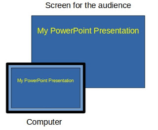
The duplicate setting shows the same presentation on the presenter’s computer and the audience’s screen. Duplicate could be understood as the standard mode of operation. 

Duplicate screen illustration. The computer and audience views are the same.
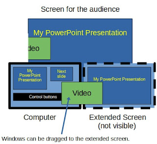
Think of the extended screen as being an imaginary monitor positioned just to the right of the computer display. Presenters can move windows (see video in green) to the extended view by dragging them to the right, from the computer desktop to the invisible extended display. Extended screens can be understood as an enhanced display space just for the audience. 
The extended screen is an imaginary screen located to the right of the computer display.


This explainer is also available as a handout that can be freely shared (CC 4.0 license). 


Monday, March 22, 2021

Using Annotation Tools to Increase Interest During Online Presentations

Like many educators, my pandemic classroom presentations have been split between in-person, classroom students and students who are watching online through video technology. The challenge is that interacting with the online audience is much harder than the classroom. My technology shares the screen (a PowerPoint presentation), but does not provide a live video during the presentation when the screen is shared. Unfortunately, watching a PowerPoint presentation with just a voice is a bit dull. 

An easy way to make the online presentations a bit more interesting is to use the annotation tools during the presentation. The tools are used to add or mark-up the existing presentation. The online students get to watch the presentation growing in a more dynamic way. It's like turning the presentation into a basic chalkboard, a time-tested teaching tool.  

The annotation tools are available by hovering the mouse over the lower left corner of the presentation. These features can also be accessed by keystrokes: control-p for pen and control-l for laser pointer. Here's the pop-up menu:  


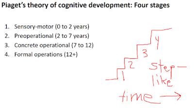
Marking up the slides has been fun and dynamic when done live. On this slide, I added that a stage-based theory of human growth has step-like qualities by drawing the following on the screen with the mouse while I'm talking. 

The annotated slides can be saved, exported to a pdf file, and shared with students. 

A related issue is that the people watching a shared computer screen at home can't see a laser pointer on the classroom screen. So, I've stopped using the laser pointer in my wireless presentation remote. Instead, the PowerPoint laser pointer is used so everyone - home and classroom - can see it. 

These built-in features are an easy way to bring at least a tiny bit of extra life to a static, shared screen presentation. They are very useful, yet underappreciated. Give it a try in your next online presentation. 


Friday, March 5, 2021

Transparency in Higher Ed PowerPoint Presentations

Transparency is a hot idea in higher education. The idea has multiple dimensions, but here we will focus on the essential "transparent" component: The need to clearly communicate the purpose of course activities to students. Why are we doing this assignment? What is the motivation? How does the current assignment connect to ideas that have already been covered? What skills will students gain by performing this task? Unfortunately, these important motivation-related questions are often not addressed. These critical ideas may be assumed by the professor rather than being explicitly stated. 

The transparency movement has focused largely on assignments, with tilthighered.com having numerous examples. My contribution is that the transparent idea could be easily extended to PowerPoint presentations. The typical classroom PowerPoint presentation has excellent facts and information. The problem is a missing 'why?' explanation. The importance or purpose might be obvious to faculty experts, but novice learners may be largely unaware of why they should care about a particular topic. 

The introduction is an ideal time to address 'why' questions. The motivational questions - why should we care? - should be addressed before launching into the facts and key terms to properly prepare students. The possibilities include ... 

  • The question: Have you ever wondered why people do/think ______? Let's explore why this occurs.
  • Establishing context: How does today's topic relate to the ideas from the last course meeting? This is how today's topic fits into important course goals. 
  • Personal relevance: Today's topic will be essential for your life or career in this way. This presentation will help you gain an expert understanding that is useful for _____. 
  • History: A long-standing concern in our field/society is ______. Today, we will investigate three different attempts to address this issue. 
The 'why' possibilities may be nearly infinite. The general aim is to address why anyone should care or find this topic interesting. A second important goal is helping students form connections between today's topic and previous topics or upcoming topics. 

Like transparent assignments, taking just a few minutes at the beginning of a presentation to address these 'why?' questions can have a big impact. It is not necessary to overhaul everything in a PowerPoint presentation to gain the benefits of transparency. One or two slides at the beginning to promote motivation and establish context can be helpful to novices. 

The transparent opening can even be a part of the slide design. Norman Eng has suggested a one sentence takeaway or mission statement. Here's an example from an opening slide in my Introductory Psychology course. 


I hope this idea has been helpful. Please consider sharing good ideas for transparent openings in PowerPoint presentations. 

Image credit
https://commons.wikimedia.org/wiki/File:Neuron.svg
User: Dhp1080, CC BY-SA 3.0 <http://creativecommons.org/licenses/by-sa/3.0/>, via Wikimedia Commons
Monday, February 1, 2021

PowerPoint at the Psychonomic Society II: Do Students Learn More From Text or Images?

The Impact of Multi-Media Presentation Format: Student Perceptions and Learning Outcomes by Katherine Moen, University of Nebraska Kearney  (Note: This is the second post in a series of PowerPoint-related presentations from the Psychonomic 2020 meeting.)

An important issue for educators is the value of text vs. images in PowerPoint presentations. Do people learn best from words or images? How many words are too many words? Academic PowerPoint presentations tend to be text-heavy. On the other hand, images may be information-rich ('a picture is worth a thousand words') in ways that add a visual-spatial component to the spoken presentation. 

This in-class study compared students who received standard PowerPoint slides (text plus small images) to student who received slides that were mostly images. The picture-based group had a small (about 5%) increase in exam scores. Student interest and engagement was about the same in both groups. 

Commentary: This is a good illustration of how information-rich instructional graphics can be superior to text-focused slides. The results are consistent with Mayer's redundancy principle: Providing text on the slide that is essentially the same as the spoken presentation does not facilitate learning. Perhaps image-based slides require students to pay more attention to the spoken presentation, which then benefits learning. When the PowerPoint is mostly images, students could be more actively engaged or processing the lecture deeper than simply copying information from slides. 

Monday, January 11, 2021

Course Calendar Tool

This Excel file is a course calendar tool. Just enter the starting date of the semester and all the other dates will be automagically calculated! It speeds up the development of course calendars. 

Screenshot:


Download the tool

Instructions / tips for using the weekly calendar:

  1. The year, month, and day in the upper right corner are the anchor points for all calculated dates. Start by entering this information.
    1. The day field should start on a Monday. 
    2. Default: The week calculations have Mondays for the start of the week. 
    3. Default: The due calculations assume that all assignments are due on Sundays. 
  2. The day offset values increase each week by seven days.
    1. The offset values can be customized. For example, use 14 day intervals for every two weeks. 
    2. For holiday weeks, it is easier to simply enter "spring break" (or whatever) compared to eliminating a week and fiddling with the day offset values.  
  3. The due date formula for Sundays is +6 from Monday (the start of the week).
    1. The due date can be adjusted. For example, Friday due dates could be set by using +4 rather than +6. 
  4. Enter the weekly topics and other special date information.
  5. Create a finished calendar for students by selecting the important cells and printing the selection to a .pdf file.  

Good luck with your courses!


Friday, January 8, 2021

PowerPoint at the Psychonomic Society: A Comparison of Different Online Presentation Styles

Background: In November, I attended the online meeting of the Psychonomic Society (a scientific community for studying cognition, perception, and behavior). This post and the following posts summarize a few scientific findings that are relevant for giving better PowerPoint presentations. 

The Study: Online and Doing It Wrong: The Impact of Presentation Style on Learning in an Online Lecture by Jaclynn Sullivan, Mount Mercy University

Description: Teaching during the pandemic has placed a new emphasis upon online presentations. This timely study compared two styles of recorded online presentations. A narrated PowerPoint presentation was compared to a video lecture that utilized a whiteboard. Students who watched the video lectures scored slightly higher than the students who viewed narrated PowerPoint presentations. The reason for this difference could be embodied cognition, possibly an "internal mirroring" of the instructor. A key quotation: "Online lectures are more impactful when they incorporate the body in some way."

Commentary: The improved performance in the video group -- a person giving a white board lecture -- seems very plausible. I have certainly felt this influence myself in watching the online presentations. Watching people is intrinsically interesting. Watching slides without people, in comparison, is not so engaging. The author attributes the increased learning in the video group to embodied cognition, but it might also be an attention effect. The video group can watch the instructor's movements, and this live action might capture student attention.  

Examples: The presentations at the online meeting provided numerous examples of these two styles. Most presentations (like mine!) were simply narrated PowerPoint presentations. It's a bit dull, for sure, to watch a narrated PowerPoint online. In contrast, there was a terrific example of a PowerPoint accompanied by live video of the presenter. Timothy Brady's talk (#143 Invited Talk: The Role of Meaning in Visual Working Memory Capacity) combined PowerPoint with live video in a powerful and compelling way (see the screenshot below). The person plus the PowerPoint was very dynamic and engaging. It's a good example to aim for if you use recorded online presentations. Nice work Timothy!