Tuesday, December 15, 2020

A single-task approach to studying unconscious perception

Steve Haase and I have been studying the difficult scientific topic of unconscious perceptual processing for over 20 years. Many experimental psychologists are of the opinion that perception must be largely unconscious, yet efforts to divide consciousness and isolate unconscious processing have often been inconclusive. 

A key methodological issue is how to separately measure awareness and perception. The standard approach is to use two different tasks, but using two tasks may create interpretational problems. In this work, we attempted a single-task approach. It was hypothesized that overall lexical decision response times would be sensitive to prime awareness, whereas response time differences on incongruent vs. congruent trials would provide evidence of perceptual processing. The results were mixed between the two experiments, with only the first experiment offering clear support for the single task hypothesis. 

The second hypothesis is that prime words or nonwords would produce nonassociative priming effects on lexical decisions (word vs. nonwords) for the target stimuli. In other words, trials with prime-target matches (word - WORD or nonword - NONWORD) would show facilitation. Both experiments showed strong stimulus congruency effects, thereby supporting nonassociative priming.  

After several rejections, we have decided to publish this work online without peer endorsement. The public availability of this document will promote open science and transparency. Perhaps this effort may be useful to other investigators in this field. 

The manuscript, a statement, and supporting data are available at the following web site: https://osf.io/62yf3/

Abstract: Most studies of unconscious perception are based upon two tasks for separately assessing perception and awareness, which may create an interpretational problem. The present experiments were performed to test the possibility that lexical decision priming might show evidence of both perception and awareness in a single task. A randomly chosen word or nonword prime stimulus was briefly displayed (17 to 100 ms), then immediately followed by a randomly chosen word or nonword target for the lexical decision task (word vs. nonword discrimination). Experiment 1 nonwords had only consonant letters (no vowels – impossible nonwords), whereas Experiment 2 nonwords had consonant – vowel patterns (word-like nonwords). A response congruency effect was obtained in both experiments. Strong evidence of a processing delay caused by conscious awareness of the prime stimulus (longer overall response times) was not obtained for the long prime duration conditions. Nonassociative congruency effects may provide some methodological advantages over classical masked semantic priming, especially when the word and nonword stimuli are dissimilar. 


Friday, September 25, 2020

A copying problem caused by making PowerPoint slides available online

Students often feel a compulsive need to write down the text from PowerPoint presentations. This is modern note-taking: a simple verbatim copy of the presented text. Their aim is to capture information that might be on future exams and store this information for future studying. The downside is that mere copying is a very passive learning approach and a distraction from what the teacher is actually saying. 

This week, I witnessed a new form of text copying that was surprising. (It was new to me, anyway.) It may be informative to people who teach with PowerPoint. 

The setting was a peer-observation of another faculty member. I was seated in the back corner of the classroom. The PowerPoint presentation had numerous key terms with complete definitions. The slide deck was available both on screen and online through the learning management system. Two students with laptop computers were seated near me with screens that could be easily seen. They had the learning management system open with the presentations loaded up. They seemed to be working hard on taking hand-written notes. So far, so good. The initial appearance was standard, college-level educational practices. 

The surprising part was that the students were actually two or three slides ahead of the presenter! They were copying information from the online PowerPoint because the amount of presented text was apparently too much to copy down in real time. Their solution was to copy text from the online presentation in advance of the actual presentation. Sadly, the spoken presentation was being ignored.  

This copying ahead of the presentation is a misguided learning strategy. It could be prevented by not providing the PowerPoint files online, but this solution misses a bigger problem. The more critical issue is that providing numerous key terms and definitions via a PowerPoint presentation is overwhelming to students. The definitions could be learned from a textbook, so there is really no need for these details in an educational presentation. Instead, educational presentations need to focus on broad ideas and instructional graphics that foster understanding instead of providing definitions. 

Return to blogging

This blog has been on hold for the past six months. The COVID-19 situation has captured all of my teaching energy. The need to prepare for classes that might be either online, traditional, or some combination has been difficult. That's putting it mildly. Near panic is a more accurate description of my feelings during this time! 

Now, I feel like things are on-track, at least as on-track as they can be given the current situation. I'm hoping to get blogging again and make it a habit. The aim is for about one post per week. 

Thursday, May 7, 2020

Statistics and the COVID-19 Crisis

The news lately has been full of statistical concepts relating to the COVID-19 virus crisis. "Flattening the curve" has become a commonly used term. Critical decisions such as reopening businesses are being based upon testing results. Here's my take on these virus-related statistics based upon my nearly 20 years of teaching introductory-level statistics classes. 

Statistics for small groups is pretty straight-forward: Test everyone and then calculate averages, make graphs, or do other summary statistics. This is called descriptive statistics. The simple goal is summarizing or describing what a group is like. An example might be a teacher summarizing the results of an exam by calculating a class average. This use of statistics is fairly simple to understand and interpret. 

A more difficult situation occurs when we study small groups of people (samples) that are drawn from much larger groups of people (populations). This is called inferential statistics. We usually study samples of people because most populations are simply too large to study. For the virus situation, it would be impossible to simultaneously test 300+ million people in the United States at the same time. 

Illustration of a representative sample


The above diagram illustrates this inferential statistics process. The large population (left circle) represents everyone in our society who may or may not have the virus. This is too many people to test, so we must settle for testing smaller samples (right circle). The conclusions from this sample group are presumably true for the population. 

Studying samples gets around the practical problem of studying millions of people. However, the risk is that the conclusions may be inaccurate. A crucial feature is that the sample must accurately represent the population, like a  miniature version of the population. In the above diagram, the population has many colors to represent the variability of people in the population. 

Illustration of a biased sample

This second diagram represents a biased sample. It illustrates how a small sample might be quite different from the population that it was drawn from. The population has many colors, but the sample is only blue. Any conclusions made from this sample might be quite misleading because of the biased sample.

We are seeing some of these sampling limitations in the current COVID-19 virus crisis. The key question is how many people have been infected? The official numbers come from small samples due to the limited availability of testing kits. Only the sickest patients are being tested in many parts of the country. There is also the issue of false negatives: people who are disease carriers yet pass a virus test without showing signs of the disease. 

Taken together, these issues suggest that the official numbers are underestimated. The true number of people who carry or die from the virus is likely higher than the official numbers. We don't really know for certain how many people have the virus in the population. It's a fuzzy picture of what's actually occurring. This statistical perspective is important to keep in mind when you see news stories about the number of people who have been infected.

Update: July 2, 2020

Several studies have been published since this blog post about the underestimation of cases. From Weinberger et al. (2020): "Official tallies of deaths due to COVID-19 underestimate the full increase in deaths associated with the pandemic in many states." The New York Times also has this nice summary of research from the CDC: "The number of coronavirus infections in many parts of the United States is more than 10 times higher than the reported rate, according to data released on Friday by the Centers for Disease Control and Prevention."

Wednesday, April 8, 2020

Assertion-Evidence Type Slides are Winning for Andrew Cuomo

Andrew Cuomo's briefings on the corona virus emergency are getting rave reviews. People are noticing his effective use of PowerPoint.
"Not since Steve Jobs’s iPhone keynote have people gotten so excited about a presentation. ... But with each briefing, it’s become increasingly apparent: There’s a secret star. His PowerPoint slides." Smith, Fast Company
 Here's another positive opinion:
"Cuomo's updates provide a lesson in the effective use of PowerPoint: His presentation slides are simple, clear and instructive." Gallo, Inc.  
There's a reason why these PowerPoint presentations are working well. Many of his slides are following an assertion-evidence formatting style. The assertion is a bold statement at the top. The evidence is a graphic that supports the statement. It's a winning combination that's works well for the audience.

Here's an example. Notice the bold statement at the top (assertion). The graphic underneath supports the statement (evidence).

Source: News10.com

This isn't a perfect example of the assertion-evidence style but it comes very close. The assertion-evidence format would work better without the unnecessary background graphic and maybe a more complete statement. For more examples, see assertion-evidence.com

Looking through his slide decks there's something that is missing: Bullet points. Very few of the slides are following the standard bullet point formatting style. Check out these examples from News10.com. Maybe you should consider ditching your old bullet point formatted slides to follow this more effective assertion-evidence format.

I thank my friend and colleague Steve Haase for alerting me to this example.


Tuesday, April 7, 2020

White text + colored background = invisible

I recently had the opportunity to help seven undergraduate students prepare for a presentation at a regional conference. These people are some of our best students. Four out of the seven students had slides that looked like this:

Slide with white text on a light blue background
White text on a colored background becomes nearly invisible in our classrooms. It's washed out. Turning off all of the overhead lights doesn't help very much. There is too much ambient light coming in from the windows and an emergency overhead light that cannot be turned off. 

The slides that had black text on a light background had much better visibility. It's a better sensory combination for most classrooms. 

Slide designs and color combinations that look good on your office computer can completely fail during a presentation. The only way to be sure is to test the appearance in the classroom. 

Thursday, April 2, 2020

Slides for Students for Free!

Slides for Students is a book about teaching with PowerPoint. The inspiration for the book was that PowerPoint offered amazing possibilities, but my presentations didn't seem very engaging to the students. The mediocre student reaction occurred even though I was following widely-used presentation standards like bullet-point formatted lists. Slides for Students is an evidence-based approach to designing better educational presentations. The focus is on teaching, but other professionals like scientists, engineers, and business people might these ideas useful too.

UNG Press is offering free pdf downloads of this book for a limited time (until August) as part of their effort to help educators cope with the COVID-19 virus emergency. This is a $40 value! I appreciate their willingness to make this special offer.

The download link is available on the book's home page at UNG Press:
https://ung.edu/university-press/books/slides-for-students.php

More information about the book is available at this online Sway presentation:
http://slidesforstudents.com

I hope you find these presentation ideas to be useful for your students. Let's work together to make the term "Death by PowerPoint" an obsolete saying!

Friday, March 20, 2020

A Quick Guide to Adding Multimedia to PowerPoint Presentations


There are several possibilities for adding narration and other forms of multimedia to PowerPoint presentations.

To begin, the right hardware is needed: A microphone for capturing voice and a webcam for video. Most laptop computers have these features built-in, but some desktops may be lacking this hardware. Webcams that include microphones are inexpensive (about $30) if your computer does not have microphone or video capture capabilities.  

The most basic software option would be to use the presentation recording options in PowerPoint. These can be accessed using the “record slide show” option of the “slide show” tab. When a recording is started, PowerPoint will capture narration plus slide transitions, pen annotations (control-p), and laser pointer effects (control-left mouse button). The resulting multimedia presentation can be saved as a PowerPoint file. Another option is to export the narrated PowerPoint file to video (file > export > video) for sharing.

For more information:

The recording and editing features of PowerPoint are limited. Techsmith’s Camtasia offers more powerful options for combining presentations with webcam video and audio. Similarly, OBS Studio is a free, open-source application for capturing and editing multimedia.

Adding audio and video to a presentation has a “wow!” factor, but there are some important downsides to consider. Multimedia requires a lot of data, resulting in large files. People with slow or unreliable internet connections could have difficulty accessing these files. If the presentation is shared as a PowerPoint file, the viewer will also need to have PowerPoint software to open the file. This can be problematic because not everyone has this software due to the expense. Finally, the creation of files with audio and video can be technically demanding and labor intensive for the presenter.

Files for sharing this blog post:

Created: March 20, 2020
Gary Fisk, Ph.D., Professor of Psychology, Georgia Southwestern State University
Author of Slides for Students, a book about teaching with PowerPoint

Monday, March 16, 2020

How to Rapidly Transform Standard PowerPoint Slides to an Online Teaching Format


When moving traditional class content online, it might seem reasonable to simply upload existing PowerPoint presentations to a learning management system and call it a day! However, most PowerPoint presentations are designed to supplement a spoken presentation. The PowerPoint content of most presentations – bullet points of key terms – may not be enough for novice learners.

One way to overcome this problem is to use the “notes” feature to write short descriptions of the essential ideas from each PowerPoint slide. The aim is to add important information that would ordinarily be spoken. The slides plus notes can then be shared with students by printing the file to a .pdf format (portable document format) for sharing on a learning management system.

Author view:

This is a PowerPoint slide with bullet points and an image.


Print to pdf:

This is the printing view showing the printer (pdf) and slides (notes pages) settings.

Creating a pdf file for sharing with students is recommended because pdf files are easier to view than PowerPoint files. The hyperlinks to relevant information are preserved in the pdf file.

There are other possibilities for adding the spoken component to a file that can be shared. The command “record slide show” from the “slide show” tab can capture voice with the slides, which can then be saved and shared. Software applications like Camtasia can add additional multimedia features, such as video. The downsides are that this approach is time-consuming and requires more technical expertise. It can also be problematic for students that don't have access to optimum technology.

Good luck with your efforts to move course content online!

I thank Ellen Cotter and Steve Haase for their helpful feedback on this idea.

Please feel free to save or share the following files that describe this approach.
Created: March 15, 2020
Gary Fisk, Ph.D., Professor of Psychology, Georgia Southwestern State University
Author of Slides for Students, a book about teaching with PowerPoint


Thursday, March 5, 2020

How to remember protoanopia, deuteranopia, and tritanopia

Dichromatism is a form of color blindness in which one of the three cone receptor subtypes is missing or abnormal. There are three possible forms, which are protoanopia, deuteranopia, and tritanopia.

It has been difficult for me to remember which name represents which form of dichromatism even though I have taught this topic for a long time. The names really didn't make much sense.

Today, this mental block was resolved. Here's a way to remember these forms and their underlying issues.

  • Protoanopia: Proto means one or first, a synonym for primitive. These individuals are missing the long wavelengths, the L or "red" cones.
  • Deuteranopia: Deuter referring to second, like the word deuce. This refers to the medium wavelengths, the M or "green" cones.
  • Triatanopia: The Tri prefix means third. This represents the short wavelengths, S or "blue". 
This scheme is ordered 1, 2, and 3 for the long, medium, and short wavelengths, respectively. Problem solved!

Summary of "No Implicit-Explicit Racial Attitude Correlation in a White Sample from the rural South of the United States"

Steve Haase and I recently published "No Implicit-Explicit Racial AttitudeCorrelation in a White Sample fromthe rural South of the United States" in the Journal of Articles in Support of the Null Hypothesis. Here's a quick take on the paper.

A consistent finding since the introduction of the Implicit Association Test (IAT) is that it correlates only weakly with explicit attitudes. The reason for the lack of a relationship is unclear. An early interpretation was that the near zero relationship is a sign of unconscious processing. There are other possibilities though, perhaps technical in nature.

We hypothesized that a larger implicit-explicit correlation could be found if the explicit attitudes were more extreme. A sample of white participants was collected from the rural South of the United States, a region with a history of black prejudice. They were tested on the Modern Racism Scale (MRS; explicit attitude) and a race IAT. The MRS scores were higher than a comparable sample from Pennsylvania, but this did not lead to a strong MRS-IAT correlation. The lack of an implicit-explicit relationship does not seem to be attributable to a restriction of range effect.

We thank Stephen Reysen (the editor) and the reviewers for being open to publishing research that does not reach the traditional criterion for statistical significance.

Thursday, February 27, 2020

Presentation at Teaching Matters on March 13, 2020

I'll be presenting a poster on "The Effective Use of PowerPoint Presentations in Education" at the Gordon State College Teaching Matters conference on March 13 (9:00am). Please consider attending this presentation if you will be at the conference.

The poster covers some key themes from the book, Slides for Students. The conference theme of work/life balance will be addressed by suggesting that PowerPoint-based content can be maintained in a systematic way that will progressively evolve while keeping stress manageable. More details will be published here after the conference. 

Tuesday, February 25, 2020

Progressive reveal animations for complex technical figures

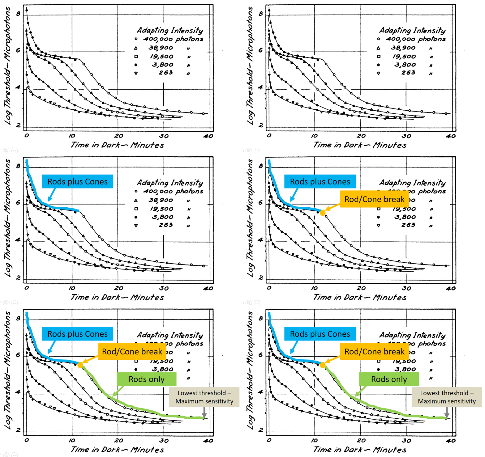
Educators and scientists are often confronted with a challenge. Technical information is a critical part of the presentation, but the amount of information might overwhelm the audience. A solution for these situations is to walk the audience through a complex diagram with a series of on-click animations that direct audience attention to the relevant parts of the slide.

The following example is a dark adaptation curve that illustrates how sensitivity to low light conditions increases over time. The plot shows a light energy threshold (the smallest amount of light that can be seen) as a function of time. The interpretation of the different plot components is progressively revealed to point out key features.


(If you're interested in dark adapation, here is the original PowerPoint file.)

Some subtle features are worthy of further consideration. This slide has no additional text to interfere with or distract from the graph comprehension. Second, the graph labels are color coded to match the relevant parts of the curve and linked with the arrow. This associates the labels and the relevant parts of the curve via the Gestalt laws of similar and connectedness. Finally, the progression of reveal starts at the beginning of dark adaptation on the left, then follows the changes over time by working towards the right. This sequence follows the natural time course of dark adaptation.

This carefully direction of attention should (hopefully!) help to make a complex technical figure more accessible to the audience.

Source: Hecht, S., Haig, C., & Chase, A. M. (1937). The influence of light adaptation on subsequent dark adaptation of the eye. The Journal of General Physiology20(6), 831-850. 

License: Creative Commons Attribution 4.0 International

Thursday, January 30, 2020

Neil DeGrasse Tyson Quote on Being an Educator

Richard Dawkins has a great quote from Neil DeGrasse Tyson that has an important insight into being a great educator. The context is that Dawkins has just given a critical presentation based upon impeccable facts. DeGrasse Tyson was concerned about the style of the presentation, so he offered the following constructive criticism.
Being an educator is not only getting the truth right, but there's got to be an act of persuasion in there as well. Persuasion isn't always 'Here's the facts, you are either an idiot or you're not.' It's 'Here's the facts, and here is a sensitivity to your state of mind.' And it's the facts plus the sensitivity, when convolved together, creates impact.  p. 262
This combination of facts plus audience sensitivity is an excellent approach to take for every presentation.

Source: Dawkins, R. (2015). A brief candle in the dark: My life in science. Harper Collins, New York

The Return of the PowerPoint Critics

Geoffrey James followed up his recent criticism of PowerPoint with another post entitled PowerPoint Has Its Defenders, But They're Wrong. In brief, his blog readers argue in favor of PowerPoint use, with some making arguments that are similar to mine. He shoots down these pro-PowerPoint arguments to maintain his position that PowerPoint has no redeeming qualities.

This statement caught my eye:
My most recent column explained that PowerPoint is a highly ineffective tool, because the premise on which it's based--that displaying words and images while you're talking improves audience retention--is scientifically invalid.
This statement is only half true.

The true part is that displaying words while the reader is talking can be problematic. The visual words and the spoken words must both be processed in the same brain area at the same time. The simultaneous processing of two information streams can't occur, so the audience must choose to focus on either the displayed words or the spoken words. This is a divided attention problem.

The false part is the suggestion that PowerPoint images are also harmful. Some scientific evidence is exactly the opposite. Dual-coding theory suggests that words (spoken for presentations) and images can combine in a complementary way to support each other and improve learning. Some decorative images might be a distraction, but it is an overstatement to think that all images are harmful to comprehension.

Here's a quick thought experiment. A friend of yours has recently traveled to some exotic location on a vacation trip. They're telling you now, in some detail, about their trip. Would you prefer to hear a verbal-only description of the trip or a verbal description plus selected pictures? The latter option would surely be more interesting and informative. In a similar manner, carefully chosen images can be helpful to presenters.

So don't throw PowerPoint into the garbage can. A well-constructed PowerPoint presentation can offer valuable support to the message that you're trying to convey. 

Friday, January 24, 2020

A rebuttal to "It's 2020. Why Are You Still Using PowerPoint?" and similar PowerPoint critics

Geoffrey James recently published opinion articles proposing that PowerPoint use should be rejected. In It's 2020. Why Are You Still Using PowerPoint? he argues that PowerPoint is ineffective and hated by everyone. In the article Jeff Bezos, Mark Cuban, and Tony Robbins Don't PowerPoint. They Do This Instead he recommends presentation approaches that deliberately avoid PowerPoint. This negative opinion of PowerPoint is similar to numerous critics such as Edward Tufte and many others.

The issues raised by PowerPoint critics should always be seriously considered. These are very real problems. James is correct in saying that media comparisons studies (i.e., PowerPoint vs. chalkboards and other technologies) done by educators and cognitive psychologists don't show much of a learning boost from PowerPoint (see my book for a thorough review). In addition, it is well-known (to cognitive psychologists anyway) that the text on a slide can compete with the words that the presenter is speaking, thereby creating a divided attention problem. What is more important to the audience, the text on the slide or the words the speaker is saying? This competition between displayed text and spoken words can detract from a speaker's message.

Although important points are raised, I disagree with this excessively negative view of PowerPoint. Here are a couple of counterpoints to consider.

There is an extensive literature in educational psychology showing that graphic images can foster the understanding of complex topics. Dual coding theories suggest that the combination of words plus instructional images can have a synergistic effect that promote learning. This is particularly true in the STEM areas, where understanding topics like "How does the heart work?" require words like key terms plus a mental visualization of the processes. There is still research work to be done in this area. It's not fully understood why graphic images are sometimes helpful for learning but sometimes are ineffective. Similarly, it's not well understood why some images promote audience interest while others may be distractions that harm a presentation.

A second point to consider is that PowerPoint is a technology. When bad presentations occur, it's the presenter who should be blamed, not the technology. Most people receive little to no training in how to give presentations. Their only training may have been a speech class in high school or college. The average person rarely gives presentations, so they have few opportunities to improve their presentation skills. Finally, most people are anxious or even terrified of speaking in public. For these people reading text off a PowerPoint slide is the easiest way through a situation that they dread and are poorly prepared to perform.

An analogy is helpful for illustrating this point. Let's imagine an artist who spends a lot of money to get the best possible paints, brushes, studio space, and other equipment. However, this artist has no training, rarely paints, and didn't have much artistic talent to begin with. They maybe even dread the painting process! The end result will be mediocre to poor art. It would be a logical error to blame the brushes and other equipment for this artistic failure. The person is at fault here. This judgment seems reasonable for art, but when it comes to presentations somehow the technology receives most of the blame rather than the presenter. (It's important to note that this analogy isn't really mine. The artist and musician David Byrne has made a similar comparison between art and PowerPoint presentations.)

In closing, I think Geoffrey James and similar critics are being excessively negative. PowerPoint adds value to a presentation when it is carefully designed to support a speaker's message. Furthermore, the proposed solutions like "go entirely slide-less" are unrealistic for the average presenter. It would be more helpful to follow-up known PowerPoint presentation problems with constructive solutions. What we really need is more training in how to give a good presentation and a better understanding of how PowerPoint works (or doesn't work) for an audience rather than simple suggestions to completely drop the use of PowerPoint. 

Tuesday, January 21, 2020

PowerPoint for General Interest Presentations: Images, Not Words

Last week, I saw a presentation on vegetable gardening given at a local Kiwanis club meeting. The presenter's interest in growing vegetables was inspired by gardens seen during mission trips abroad as well as the health benefits of eating more vegetables. He showed his raised bed system with automated watering and other nice features. It was an inspirational presentation. I left wanting plant some veggies!

During PowerPoint presentations I often have two tracks of thought. One track is about the presentation content. The other track is a process thought: What is working (or not working) about this presentation?

This presentation clearly worked well in part because the presenter was intelligent, well-informed, and very passionate about the subject. Another important aspect though was the PowerPoint presentation. The presentation had very few words. The PowerPoint content was mostly a picture slide show of gardens, with healthy vegetable plants and happy gardeners. The images supported the presentation content and helped to illustrate key points. The slides promoted audience engagement largely because of the heavy use of educational images rather than text or bullet points.

The take-home PowerPoint thought is that images (not text) are the most engaging for a non-technical, non-academic kind of presentation.

Friday, January 10, 2020

PowerPoint design: Background images that cause sensory failures

A student who recently gave a PowerPoint presentation in my class was aiming for an industrial-type appearance in his slides. The background was sliver with black holes. The image looked like a kitchen colander, but flat. The font was small and black.

The overall appearance was similar to this:


This slide design fails on a sensory level. The background image has grey and black that is similar to the font, leading to a low degree of contrast between the text and the background. The image is very detailed, which produces a noisy feeling. Finally, the text is simply too small to be seen from a distance.

An important design principle for sensory success is to have a high degree of contrast between the foreground (text) and the background. Our visual system works by detecting the degree of difference. Thus, designs that decrease contrast can be difficult to read or understand.

Credit: The background image was based upon a free image from the following source.
https://www.peakpx.com/637287/rubber-grid-regularly-floor-mat-backgrounds-silver-colored

Hello world!

Hello world!

This is my new blog. The main topic will be PowerPoint presentations, especially for educational purposes. This is a follow-up to my book: Slides for Students. Some of the ideas presented here may find their way into future editions of Slides for Students or possibly other publications.

Another interest is perception and how it relates to everyday life. I may also post about homebrewing once in a while.

Thanks for joining me.

Gary