Educators and scientists are often confronted with a challenge. Technical information is a critical part of the presentation, but the amount of information might overwhelm the audience. A solution for these situations is to walk the audience through a complex diagram with a series of on-click animations that direct audience attention to the relevant parts of the slide.
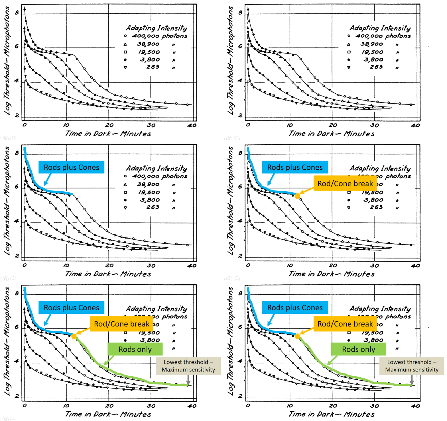
The following example is a dark adaptation curve that illustrates how sensitivity to low light conditions increases over time. The plot shows a light energy threshold (the smallest amount of light that can be seen) as a function of time. The interpretation of the different plot components is progressively revealed to point out key features.
(If you're interested in dark adapation, here is the original PowerPoint file.)
Some subtle features are worthy of further consideration. This slide has no additional text to interfere with or distract from the graph comprehension. Second, the graph labels are color coded to match the relevant parts of the curve and linked with the arrow. This associates the labels and the relevant parts of the curve via the Gestalt laws of similar and connectedness. Finally, the progression of reveal starts at the beginning of dark adaptation on the left, then follows the changes over time by working towards the right. This sequence follows the natural time course of dark adaptation.
This carefully direction of attention should (hopefully!) help to make a complex technical figure more accessible to the audience.
Source: Hecht, S., Haig, C., & Chase, A. M. (1937). The influence of light adaptation on subsequent dark adaptation of the eye. The Journal of General Physiology, 20(6), 831-850.
License: Creative Commons Attribution 4.0 International

No comments:
Post a Comment